I’m adapting my old personal blog (and not-regularly updated ) to have my first contact with Frontity. What I’m wanting to achieve is basically show my posts and pages, and entirely customize the default Frontity theme to use my own look and feel. At the end, I want to start using Frontity in my production environment in a couple of days.
I’m starting this new topic because, when I first tried to navigate through my Wordpress site using Frontity (without customizing and modifying anything), it wasn’t applying any style to the .wp-block-columns class, and because that, columns weren’t working and pages weren’t properly displayed. Apologies in advance if this is not in the appropriate place to share this, but I wanted also to have the opportunity to ask if I’m solving the problem in an acceptable way, or as the expected way.
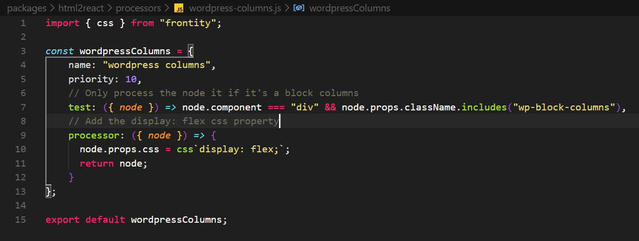
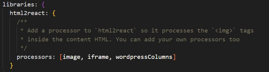
I resolved this creating a new processor that applies the display: flex property, and including that processor in the html2react library.
This is how my processor looks: (Created following the Frontity start guide)
Hope that this can help to someone. And of course, please if this is not the way to do these things, I would really appreciate to know it and get more used to work with Frontity.
So my solution is very different and may not be the best way of doing it, but it was the only way I could think of solving it. My understanding of how the WordPress Gutenberg Columns work is simply with CSS. Meaning I do not believe there is any JS involved in the visual design of the columns. So my solution was to simply add the CSS from the Gutenberg CSS file which you should be able to find in your WordPress Installation and copy the CSS to the Global Component in my Frontity Theme.
This is the CSS I added (with a few minor changes) taken from the Gutenberg CSS file:
Thank you for sharing. I’m only applying one CSS property to a div, so probably the entire Gutenberg system is not going to look exactly as they would look on a traditional Wordpress. I’ll take a look at your repo to apply all the CSS, thanks again for sharing.
BTW, I solved it that way, because the Frontity guide says that it isn’t a good idea to define styles in the global component for anything rather than an HTML element, and encourages developers to use CSS-in-JS.
However, it’s strange to filter elements by their CSS classes, to finally apply styles using CSS-in-JS. Probably a bad practice, and difficult to handle if I want to add all the Gutemberg styles that way.
I’ve taken too seriously one phrase of the starting guide
Hey, @oriol, don’t worry! We also did it that way in our frontity.org theme.
Right now, there are three ways for adding styles to elements in the content:
1. Using <Global>
Adding the CSS code using the Global component is easy, as @ShaGui did in his theme. The drawback here is that all the CSS would be included in the HTML reponse for all the pages, even though the current link doesn’t show any content. This can make the server response unnecessarily large.
2. Adding styles to <Content>
This approach is similar to the previous one but adding the CSS to the Content component instead of using Global for that. You have the same problem as the option 1. before, but at least the CSS is not included if Content is not rendered, so it’s a bit better.
3. Using processors
With this option, the CSS is only included when the element using that style is in the content, and it won’t be included otherwise. We used this pattern a lot in our theme (check it out here). For me it’s a bit weird too, and although the HTML would be smaller, it increases the bundle size and it is extra code that has to run every time the content is rendered, so it’s not a perfect solution either.
You can choose whatever option you think that fits better for your project.
 ) to have my first contact with Frontity. What I’m wanting to achieve is basically show my posts and pages, and entirely customize the default Frontity theme to use my own look and feel. At the end, I want to start using Frontity in my production environment in a couple of days.