Yes, that’s right. We can inject the latest CSS by default unless they want to specify a version in the package settings.
One question for @jesus.designer or any other developer with experience creating Gutenberg blocks:
How does the CSS of custom blocks work? Does it work the way Mario described or is there something we are still missing?
It is possible to enqueue the files from the block registration function
register_block_type('name', [ 'style' => 'name-css-registed', ])
Another way I use is enqueue the files when you have to render the block through has_block ()
Many block collections include CSS or JS of the frontend without tied to specific block, I can’t think a simple way to include all assets
A possible solution could be a wordpress plugin, where the list of assets appears and you can mark which ones you want to include in your frontity frontend
I see. Thanks @jesus.designer!
Maybe we should add support for the default Gutenberg blocks and then think about how to support custom ones 
1 Like
It looks like the officially recommended way to include scripts is the register_block_type('name', [ 'style' => 'name-css-registed', ]) one so maybe we should support that.
1 Like
This part of the Block Editor Handbook is very interesting:
https://developer.wordpress.org/block-editor/developers/themes/theme-support/
It looks like themes should use add_theme_support() to opt-in to several Gutenberg features. Some for the editor and some for the frontend.
These are some of the optionns:
add_theme_support( ‘wp-block-styles’ );
This enqueues the /wp-includes/css/dist/block-library/theme.min.css file.
The /wp-includes/css/dist/block-library/style.min.css is always enqueued, no matter what.
The definition of this feature is:
Core blocks include default styles. The styles are enqueued for editing but are not enqueued for viewing unless the theme opts-in to the core styles. If you’d like to use default styles in your theme, add theme support for
wp-block-styles.
–> What should we do in @frontity/gutenberg?
Maybe this could be optional in our package as well.
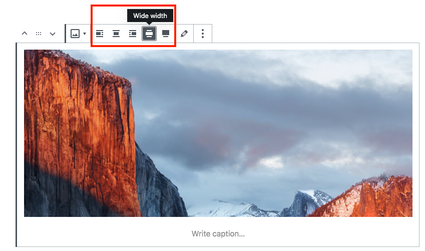
add_theme_support( ‘align-wide’ )
This only adds two new options for images.
If it’s not active, images can be center, aligned right or aligned left:

but if it’s active, two new options appear: width wide and full width:
With no-alignment (nothing selected), the HTML of an image is:
<figure class="wp-block-image">
  <img ...>
</figure>
With align left, the HTML of an image is:
<div class="wp-block-image">
  <figure class="alignleft">
    <img ...>
  </figure>
</div>
With align right, the HTML of an image is:
<div class="wp-block-image">
  <figure class="alignright">
    <img ...>
  </figure>
</div>
With align center, the HTML of an image is:
<div class="wp-block-image">
  <figure class="aligncenter">
    <img ...>
  </figure>
</div>
With wide width, the HTML of an image is:
<figure class="wp-block-image alignwide">
  <img ...>
</figure>
And finally with full width, the HTML of an image is:
<figure class="wp-block-image alignfull">
  <img ...>
</figure>
An example of this styles is in https://codepen.io/joen/pen/zLWvrW.
I’ve tested all the images with the /wp-includes/css/dist/block-library/style.min.css and all they work fine.
–> What should we do in @frontity/gutenberg?
This should work out of the box at soon as we include the CSS from block-library/style.min.css.
add_theme_support( ‘responsive-embeds’ )
This only adds a class wp-embed-responsive to the body. When that class is present, embeds become responsive. The work is done by the /wp-includes/css/dist/block-library/style.min.css styles.
–> What should we do in @frontity/gutenberg?
This should work out of the box at soon as we include the CSS from block-library/style.min.css.
add_theme_support( ‘editor-color-palette’ )
A default set of colors is provided, but themes can register their own and optionally lock users into picking from the defined palette.
function mytheme_setup_theme_supported_features() {
    add_theme_support( 'editor-color-palette', array(
        array(
            'name' => __( 'strong magenta', 'themeLangDomain' ),
            'slug' => 'strong-magenta',
            'color' => '#a156b4',
        ),
        array(
            'name' => __( 'light grayish magenta', 'themeLangDomain' ),
            'slug' => 'light-grayish-magenta',
            'color' => '#d0a5db',
        ),
        array(
            'name' => __( 'very light gray', 'themeLangDomain' ),
            'slug' => 'very-light-gray',
            'color' => '#eee',
        )
    ));
}

add_action( 'after_setup_theme', 'mytheme_setup_theme_supported_features' );
–> What should we do in our frontity-wp-plugin?
I’ve tested this code in a plugin (instead of a theme) and it works. That means we can include a color picker in our Frontity plugin and let people create their own Gutenberg color palettes.
add_theme_support( ‘editor-font-sizes’ )
A default set of sizes is provided, but themes can register their own and optionally lock users into picking from preselected sizes.
function mytheme_setup_theme_supported_features() {
    add_theme_support(
			'editor-font-sizes',
			array(
				array(
					'name'      => __( 'Small', 'twentynineteen' ),
					'shortName' => __( 'S', 'twentynineteen' ),
					'size'      => 19.5,
					'slug'      => 'small',
				),
				array(
					'name'      => __( 'Normal', 'twentynineteen' ),
					'shortName' => __( 'M', 'twentynineteen' ),
					'size'      => 22,
					'slug'      => 'normal',
				),
				array(
					'name'      => __( 'Large', 'twentynineteen' ),
					'shortName' => __( 'L', 'twentynineteen' ),
					'size'      => 36.5,
					'slug'      => 'large',
				)
			)
		);

}

add_action( 'after_setup_theme', 'mytheme_setup_theme_supported_features' );
–> What should we do in our frontity-wp-plugin?
This is similar to the color palette and also works in a plugin, so we can do the same.
2 Likes
Great to see ya’ll working on this.
If I can give some quick thoughts.
Personally I really like the Gutenberg editor but your breakdown here I think reveals some of the oddities of it.
For instance:
but then for the wide width stuff we get:
When I first started using Gutenberg all images were <figure> class="wp-block-image"> but now all the figures are wrapped in <div class="wp-block-image>… except for the wide and full width images? for… I have no clue what reason. In fact I actually created a github ticket on this very issue last week: https://github.com/WordPress/gutenberg/issues/18122
Hey this github merge might help clarify some stuff: https://github.com/WordPress/gutenberg/pull/7721
Hey reporting back in on a related issue.
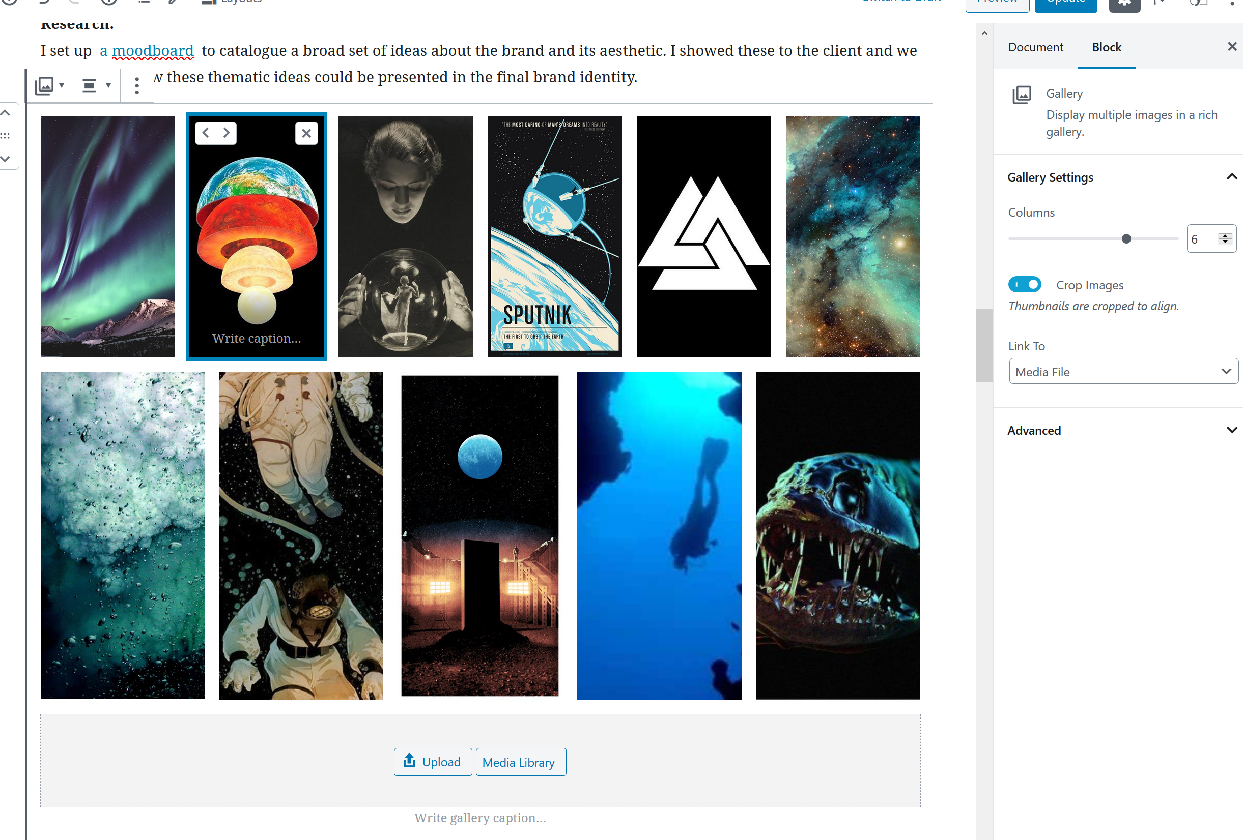
Is “is-cropped” going to be supported by Frontity for gallery elements? Currently it does not seem to be and I imagine that’s because you’d have to pass in additional logic for the image processor to know to grab the cropped thumbnail right?
Hey @thedonquixotic, sorry we haven’t been very responsive lately. I hope that doesn’t happen again.
Actually, I was taking a look yesterday at this and a I saw your latest issue: https://github.com/WordPress/gutenberg/issues/18276
Let’s see what they say. It makes sense for me although I’m quite bad with CSS actually 
From a quick look at Gutenberg’s CSS, it looks like there are some support in it:
.blocks-gallery-grid.is-cropped .blocks-gallery-image a,.blocks-gallery-grid.is-cropped .blocks-gallery-image img,.blocks-gallery-grid.is-cropped .blocks-gallery-item a,.blocks-gallery-grid.is-cropped .blocks-gallery-item img,.wp-block-gallery.is-cropped .blocks-gallery-image a,.wp-block-gallery.is-cropped .blocks-gallery-image img,.wp-block-gallery.is-cropped .blocks-gallery-item a,.wp-block-gallery.is-cropped .blocks-gallery-item img {
    width: 100%
}

@supports ((position: -webkit-sticky) or (position:sticky)) {
    .blocks-gallery-grid.is-cropped .blocks-gallery-image a,.blocks-gallery-grid.is-cropped .blocks-gallery-image img,.blocks-gallery-grid.is-cropped .blocks-gallery-item a,.blocks-gallery-grid.is-cropped .blocks-gallery-item img,.wp-block-gallery.is-cropped .blocks-gallery-image a,.wp-block-gallery.is-cropped .blocks-gallery-image img,.wp-block-gallery.is-cropped .blocks-gallery-item a,.wp-block-gallery.is-cropped .blocks-gallery-item img {
        height:100%;
        flex: 1;
        -o-object-fit: cover;
        object-fit: cover
    }
}
If that’s what you need, then yes, it will be included in the @frontity/gutenberg package.
Hey so yeah that doesn’t work but I did some more research and realized that is-cropped could be supported using just CSS and object fit like so:
figure.wp-block-gallery {


  &.columns-6 {
    .blocks-gallery-grid {
      margin: unset !important;
      display: flex;
      flex-wrap: wrap;
      align-content: center;
      justify-content: center;
      align-items: baseline;

      .blocks-gallery-item {
        margin: 10px;

        figure {
          img {
            /* max-width: 16vw; */
          }
        }
      }
    }

    &.is-cropped {
      li {
        object-fit: cover;
        height: 16vw;
        width: 16vw;

        figure {
          object-fit: cover;
          height: 100%;
          width: 100%;

          img {
            object-fit: cover;
            height: 100%;
            width: 100%;
          }
        }
      }
    }
  }
}
So, isn’t this supported by the Gutenberg CSS? Do PHP themes need to support it themselves?
Sorry for the delay in replying. I think on wordpress it actually passes it a different image size (it sends a thumbnail rather than a medium or large image). So php themes don’t have to worry about supporting it but anything that’s grabbing the html content via a json request probably will need to, and I don’t think Gutenberg accounts for that.
That’s weird because the HTML content on PHP and the HTML content in content.rendered should exactly the same. Do you have a URL where that is not the case that we could take a look at?
Ah I think I might actually be wrong, but my addition of “is-cropped” seems to still be needed.
Here’s a comparison of two posts to give context on how the editor content output has changed.
[This one] is a custom post type called “case study” that I made a few years back when I first created my portfolio in wordpress. It was created using the classic editor.
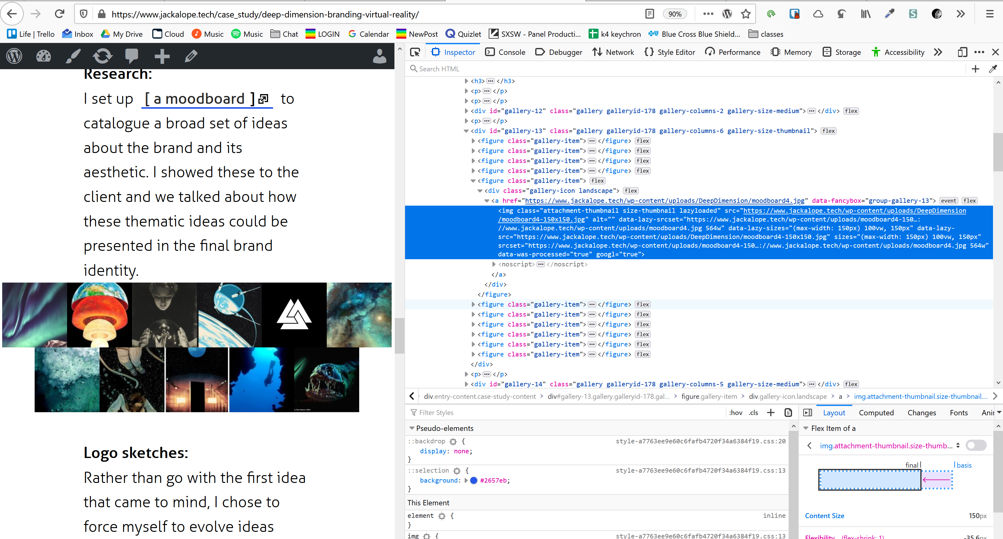
editor view:
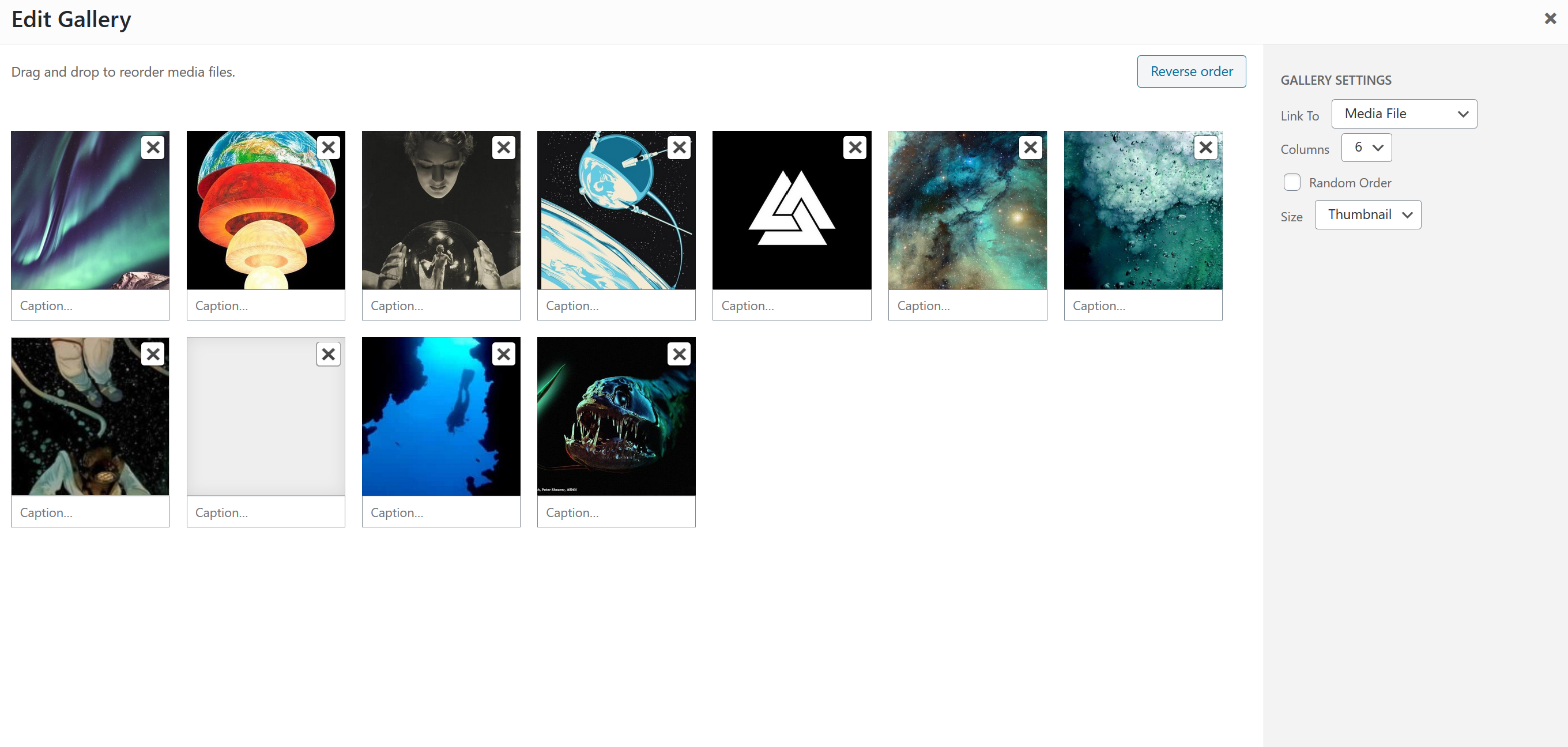
and [this one] is a custom post type called “test_posts” that I recently created to use as a content source for my new portfolio website that I’m building with frontity. It was created using the gutenberg editor.
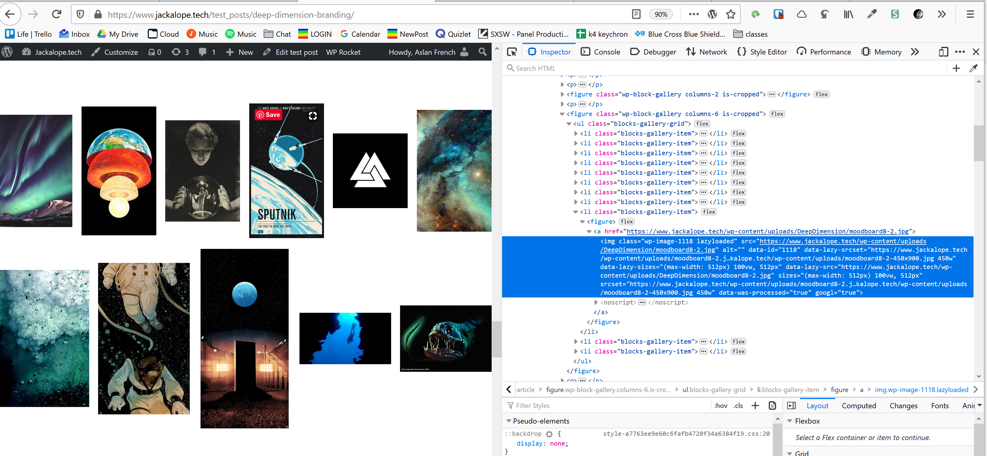
editor view
As you can see the classic editor crops. The Gutenberg editor crops in the admin but not in a square format, and it doesn’t crop on the frontend though that’s probably attributable to my PHP theme not adding any styles for it.
Either way, I can confirm that running a default mars theme with images that have been set to “crop” and which have the class of “is cropped” does not work.
1 Like
I’ve started working on the Gutenberg package in this PR: https://github.com/frontity/frontity/pull/255
I’m going to make a 1.0.0 version for WP 5.0, then a 1.1.0 version for 5.2, a 1.2.0 version for 5.3 and then the same for the different Gutenberg plugin versions.
Gutenberg has a CSS file for LTR (left to right) and another for RTL (right to left) but they are quite similar so instead of adding both I’ll introduce a setting that then will be read by emotion.
For the first release I’ll just add the styles to a Global but in the future we can use processors to modify emotion css prop.
Apart from that, I’ll fix the Image component because right now it’s adding an extra span and that brokes the CSS for alignments. @orballo and @david maybe I’m going to need help with that
4 Likes
I wonder if, instead of copying the compiled css directly we pull in @wordpress/block-library which is a npm package and potentially @wordpress/base-styles (which I think would be needed) and compile all the style.scss files within each core block into something we load through the @frontity/gutenberg package.
Both of these packages would be dev dependencies.
For reference, this is how Gutenberg compiles its css: https://github.com/WordPress/gutenberg/blob/master/webpack.config.js#L122
That’s a great idea @nicholasio.oliveira, thanks. I was not aware of this npm package. We can include a build step to compile the scss files from that package and avoid the copy/paste.
I guess we’d still need to do that build manually and release multiple versions of our package to be able to support old WP and Gutenberg plugin versions, but yes, it seems feasible 
This will be useful to create different versions of the package that match the different versions of WP/Gutenberg: https://developer.wordpress.org/block-editor/principles/versions-in-wordpress/