Description
Frontity extensibility was designed to avoid the need to modify the code of a theme when users want to add new features.
@mymakarim has created sharing buttons that can be used across themes and shared it in this post: Add Sharing buttons in single post page
His work is awesome, but with that approach the code of each themes that wants to use those share buttons needs to be modified. We need to find alternative ways to do this integration, so if a final user want to use those share buttons in their theme, he/she can just install the package and configure its settings, similar to what he/she would do with a WordPress plugin.
To solve that, we should provide an official way to add share packages in Frontity, using the share namespace.
Context / Background
The share buttons are a great example of something that could be easily managed by external packages. The main reasons to do it are:
- The more things we can take out of the themes, the easier is going to be creating new themes without having to add the same code over and over.
- The more things we decouple from themes, the more versatile they are going to be for the final user of the theme because he/she will have more choices.
- The ultimate goal of Frontity is that it can be used by non-coders, like WordPress. For that reason, adding new feature to a theme should not require code modifications.
Goals
As a Frontity theme user
I want to use share buttons from external Frontity packages
so that I get to choose exactly the share buttons that I want.
As a Frontity theme developer
I want to integrate my theme with share packages
so that I don’t have to hardcode them in my theme.
Existing Solution / Workaround
The current solution is to add the share buttons in each theme, like what @Segun did in his Chakra Theme or @mymakarim did in this post Add Sharing buttons in single post page.
Implementation Proposal
These are the different approaches we can try first:
- Use a Slot to add the share buttons.
- Add the buttons to a fixed menu on mobile when the user is viewing a post.
- Add the buttons to a modal that appears when the user clicks a button.
- Add the buttons to a special place of the theme, specially designed for share buttons.
Use a Slot
The share packages should export a Fill that can be configured by the user.
import ShareButtons from "./components/share-buttons";

export default {
  libraries: {
    fills: {
      share: {
        ShareButtons,
      },
    },
  },
};
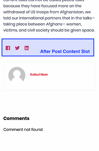
For example, imagine the theme has a Slot right after the post content called After Post Content. Then, the users of the share package can configure the fill in their frontity.settings.js file like this:
const settings = {
  // ...
  packages: [
    {
      name: "some-share-package",
      state: {
        fills: {
          share: {
            ShareAfterPostContent: {
              slot: "After Post Content",
              library: "share.ShareButtons",
            },
          },
        },
      },
    },
  ],
};
This will be especially useful for packages not having dedicated support for share packages.
Bear in mind that the <Slot> component will pass a data prop to the fills, so the <ShareButtons> component must use it to get the link or whatever other info it needs.
const ShareButtons = ({ data, state }) => {
  const post = state.source[data.type][data.id];
  const link = data.link;
  const title = post.title.rendered;

  // ...
};

export default connect(ShareButtons);
Use a fixed menu on mobile when the user is viewing a post
Another way share packages can be configured is by using a fixed menu. This is a common approach in some mobile themes. For example:
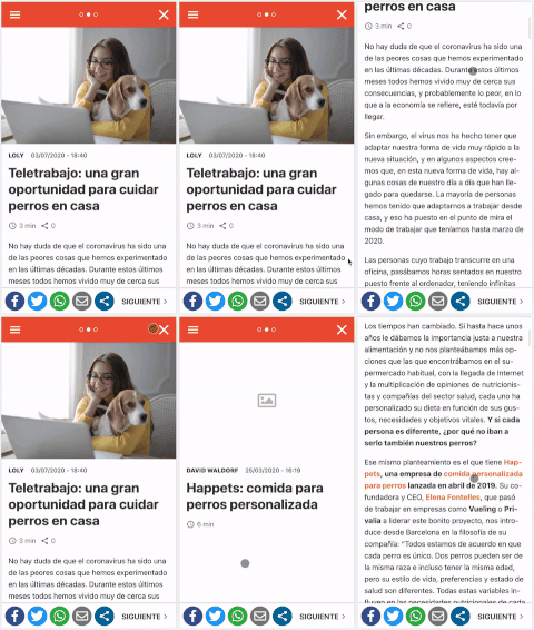
As this is a fixed menu rendered on top of the theme, the share package doesn’t need any integration with the theme. It can just export the fixed menu in its Root component and display it when the user is viewing a post. For example:
const ShareRoot = ({ state }) => {
  const data = state.source.get(state.router.link);

  // Show the fixed menu.
  if (state.share.fixedMenu && data.isPost) return <FixedMenu />;

  // Show nothing.
  return null;
};

export default {
  roots: {
    share: ShareRoot,
  },
  state: {
    share: {
      /** Display a fixed menu on the bottom of the posts. **/
      fixedMenu: true,
    },
  },
};
If the fixed menu is only supposed to be shown for mobile/tablet devices, it can hide itself using CSS media queries.
Use a modal that appears when the user clicks a button
Other themes have a modal that appears when the user clicks on a button. For example:
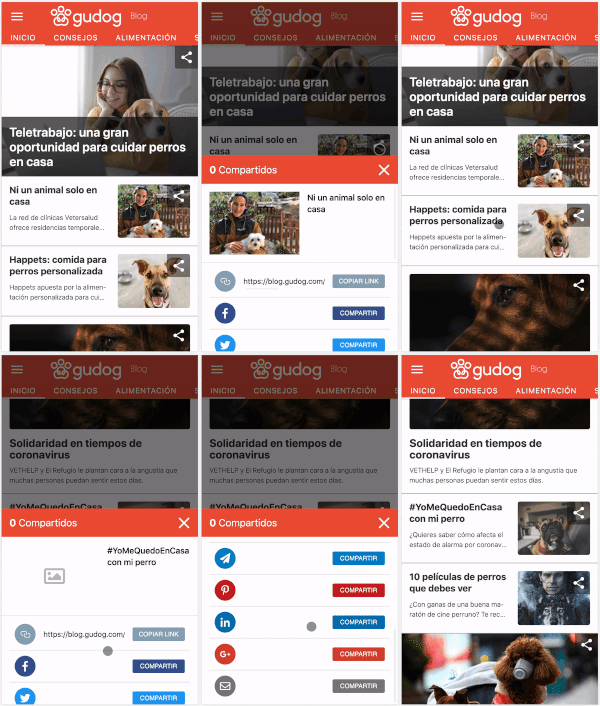
This option will require the theme to know if a share button is installed, and if it is, it can:
- Show the “Share” button.
- Trigger the
actions.share.openModal action when it’s clicked.
- If it belongs to an archive, pass the relevant
data to the openModal action.
const ShareModalButton = ({ actions, data }) => (
  <div onClick={() => actions.share.openModal({ data })}>
    <ShareIcon />
  </div>
);

const Archive = ({ state, data }) => {
  const data = state.source.get(state.router.link);

  return data.items.map(({ link }) => {
    const postData = state.source.get(link);
    const post = state.source[data.type][data.id];

    return (
      <>
        <Title title={post.title.rendered} />
        <Author authorId={post.author} />
        {/** If there is a share package, show a button to open the modal **/}
        {state.share && <ShareModalButton data={postData} />}
        <FaturedImage mediaId={post.featured} />
      </>
    );
  });
};
Let the theme choose the part of the layout where the buttons should show
Finally, themes can choose the specific place where the buttons should be shown, if a share package is present. Similar to the previous point, but showing all the buttons instead of just one that opens the modal. For example, something like what @mymakarim did in his Code Nawais theme.
const Post = ({ state, libraries }) => {
  const ShareButtons = libraries.fills.share.ShareButtons;

  return (
    <>
      <Title />
      <Author />
      {/** If there is a share package, show all the buttons **/}
      {state.share && <ShareButtons />}
      <Content />
    </>
  );
};
This is similar to the approach we are going to use on the comments packages and maybe other namespaces like newsletter.
The @frontity/share package
We need a package that exposes the types for the common state/actions/libraries of all share packages.
Not all the options I’ve shown before need a consensus, but some of them do.
-
The name of the fill: because theme packages should be able to reference it by using
libraries.fills.share.ShareButtons explicitly.
-
The actions to open/close the modal: because theme packages should be able to reference them by using
actions.share.openModal explicitly.
I wasn’t able to finish the Implementation Proposal. I’ll review it and finish as soon as possible.
Open Questions
-
Maybe share packages could also expose a hook (via libraries) that returns an array of buttons in case themes want to have more control over the layout.
-
We need to think about the way the share packages are going to gather the settings. It may be useful to collect that information always in the same way so other packages can see/use the information. For example, the Twitter account.



 , check it out and let me know your comments.
